14 Data visualization for web-based maps
14.1 Learning Objectives
In this lesson, you will learn:
- How to use RMarkdown to build a web site
- A quick overview of producing nice visualizations in R with
ggplot - How to create interactive maps with
leaflet - Publishing interactive maps using RMarkdown to make a GitHub web site
14.2 Introduction
Sharing your work with others in engaging ways is an important part of the scientific process. So far in this course, we’ve introduced a small set of powerful tools for doing open science:
- R and its many packages
- RStudio
- git
- GiHub
- RMarkdown
RMarkdown, in particular, is amazingly powerful for creating scientific reports but, so far, we haven’t tapped its full potential for sharing our work with others.
In this lesson, we’re going to take an existing GitHub repository and turn it into a beautiful and easy to read web page using the tools listed above.
14.3 A Minimal Example
- Create a new repository on GitHub
- Initialize the repository on GitHub without any files in it
- In RStudio,
- Create a new Project
- When creating, select the option to create from Version Control -> Git
- Enter your repository’s clone URL in the Repository URL field and fill in the rest of the details
- Add a new file at the top level called
index.Rmd. The easiest way to do this is through the RStudio menu. Choose File -> New File -> RMarkdown… This will bring up a dialog box. You should create a “Document” in “HTML” format. These are the default options. - Open
index.Rmd(if it isn’t already open) - Press Knit
- Observe the rendered output
- Notice the new file in the same directory
index.html. This is our RMarkdown file rendered as HTML (a web page)
- Commit your changes (to both index.Rmd and index.html)
- Open your web browser to the GitHub.com page for your repository
Go to Settings > GitHub Pages and turn on GitHub Pages for the
masterbranchNow, the rendered website version of your repo will show up at a special URL.
GitHub Pages follows a convention like this:
https://{username}.github.io/{repository}/ https://mbjones.github.io/arctic-training-repo/Note that it will no longer be at github.com but github.io.
Go to https://{username}.github.io/{repo_name}/ (Note the trailing
/) Observe the awesome rendered output
14.4 A Less Minimal Example
Now that we’ve seen how to create a web page from RMarkdown, let’s create a website that uses some of the cool functionality available to us. We’ll use the same git repository and RStudio Project as above, but we’ll be adding some files to the repository and modifying index.Rmd.
First, let’s get some data. We’ll re-use the salmon escapement data from the ADF&G OceanAK database:
- Navigate to Escapement Counts (or visit the KNB and search for ‘oceanak’) and copy the Download URL for the
ADFG_firstAttempt_reformatted.csvfile - Download that file into R using
read.csvto make the script portable - Calculate median annual escapement by species using the
dplyrpackage - Make a bar plot of the median annual escapement by species using the
ggplot2package - Display it in an interactive table with the
datatablefunction from theDTpackage - And lastly, let’s make an interactive, Google Maps-like map of the escapement sampling locations.
To do this, we’ll use the leaflet package to create an interactive map with markers for all the sampling locations:
First, let’s load the packages we’ll need:
suppressPackageStartupMessages({
  library(leaflet)
  library(dplyr)
  library(tidyr)
  library(ggplot2)
  library(DT)
})
14.4.1 Load salmon escapement data
You can load the data table directly from the KNB Data Repository, if it isn’t already present on your local computer. This technique
data_url <- "https://knb.ecoinformatics.org/knb/d1/mn/v2/object/knb.92020.1"
# data_url <- "https://knb.ecoinformatics.org/knb/d1/mn/v2/object/urn%3Auuid%3Af119a05b-bbe7-4aea-93c6-85434dcb1c5e"
esc <- tryCatch(
    read.csv("data/escapement.csv", stringsAsFactors = FALSE),
    error=function(cond) {
        message(paste("Escapement file does not seem to exist, so get it from the KNB."))
        esc <- read.csv(url(data_url, method = "libcurl"), stringsAsFactors = FALSE)
        return(esc)
    }
)

head(esc)
## Location SASAP.Region sampleDate Species DailyCount Method
## 1 Akalura Creek Kodiak 1930-05-24 Sockeye 4 Unknown
## 2 Akalura Creek Kodiak 1930-05-25 Sockeye 10 Unknown
## 3 Akalura Creek Kodiak 1930-05-26 Sockeye 0 Unknown
## 4 Akalura Creek Kodiak 1930-05-27 Sockeye 0 Unknown
## 5 Akalura Creek Kodiak 1930-05-28 Sockeye 0 Unknown
## 6 Akalura Creek Kodiak 1930-05-29 Sockeye 0 Unknown
## Latitude Longitude Source
## 1 57.1641 -154.2287 ADFG
## 2 57.1641 -154.2287 ADFG
## 3 57.1641 -154.2287 ADFG
## 4 57.1641 -154.2287 ADFG
## 5 57.1641 -154.2287 ADFG
## 6 57.1641 -154.2287 ADFG14.4.2 Plot median escapement
Now that we have the data loaded, let’s calculate median annual escapement by species:
median_esc <- esc %>%
  separate(sampleDate, c("Year", "Month", "Day"), sep = "-") %>%
  group_by(Species, SASAP.Region, Year, Location) %>%
  summarize(escapement = sum(DailyCount)) %>%
  group_by(Species) %>%
  summarize(median_escapement = median(escapement))

head(median_esc)
## # A tibble: 6 x 2
## Species median_escapement
## <chr> <dbl>
## 1 Anadromous dolly varden 0
## 2 Chinook 541
## 3 Chum 153
## 4 Chum - Fall 430233
## 5 Chum - Summer 642529
## 6 Coho 1978That command used a lot of the dplyr commands that we’ve used, and some that are new. The separate function is used to divide the sampleDate column up into Year, Month, and Day columns, and then we use group_by to indicate that we want to calculate our results for the unique combinations of species, region, year, and location. We next use summarize to calculate an escapement value for each of these groups, which we then proceed to further group by species to caluclate the median for each species.
Now, let’s plot our results:
ggplot(median_esc, aes(Species, median_escapement)) +
  geom_col() +
  coord_flip()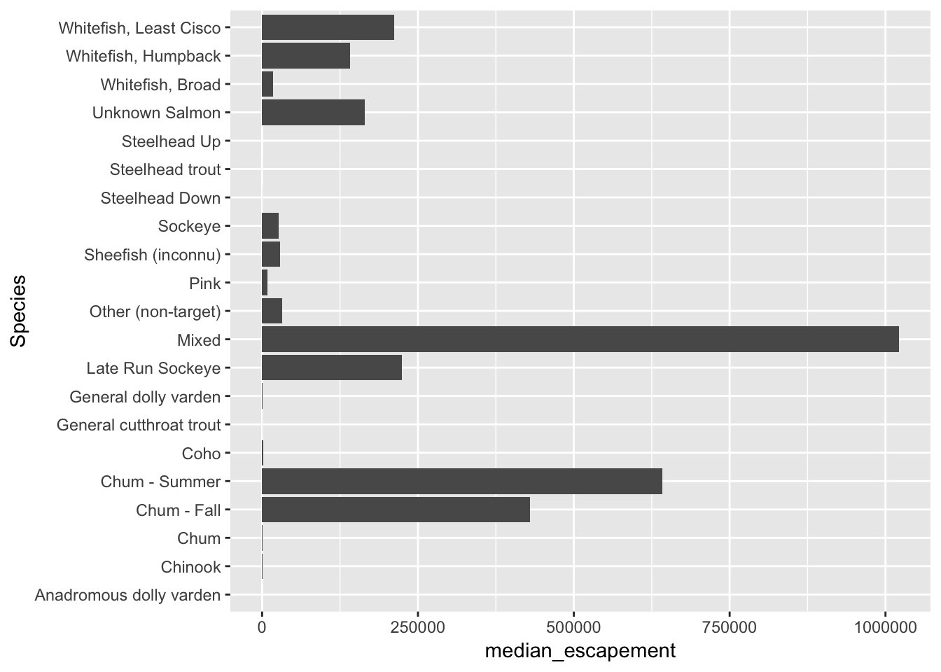
Now let’s convert the escapement data into a table of just the unique locations:
locations <- esc %>%
  distinct(Location, Latitude, Longitude) %>%
  drop_na()
And display it as an interactive table:
datatable(locations)Then making a leaflet map is (generally) only a couple of lines of code:
leaflet(locations) %>%
  addTiles() %>%
  addMarkers(~ Longitude, ~ Latitude, popup = ~ Location)
The addTiles() function gets a base layer of tiles from OpenStreetMap which is an open alternative to Google Maps. addMarkers use a bit of an odd syntax in that it looks kind of like ggplot2 code but uses ~ before the column names. This is similar to how the lm function (and others) work but you’ll have to make sure you type the ~ for your map to work.
This map hopefully gives you an idea of how powerful the combination of RMarkdown and GitHub pages can be. …and it makes a problem with these data much more obvious than in tabular form. Do you see all those points way over in Russia? This is an Alaskan data set. Those aren’t supposed to be there. Can you guess why they’re showing up over there? If you glance through the coordinates in the locations table above it should become obvious. Here’s how to fix it:
locs <- locations %>% mutate(Longitude = abs(Longitude) * -1)

leaflet(locs) %>%
  addTiles() %>%
  addMarkers(~ Longitude, ~ Latitude, popup = ~ Location)
14.4.3 Missing map markers
When you knit and view the results of this cell locally (on your own computer), you will see a map with icons marking the locations. However, sometimes when you push the html to GitHub and view your page there, you’ll see a map with no icons. This appears to be due to a certificate issue with server that provides the leaflet icons. There is a workaround, but it adds several more lines of code.
First, we use makeIcon to create a local version of the icon symbols to be plotted on the map:
# Use a custom marker so Leaflet doesn't try to grab the marker images from
# its CDN (this was brought up in
# https://github.com/NCEAS/sasap-training/issues/22)
markerIcon <- makeIcon(
  iconUrl = "https://cdnjs.cloudflare.com/ajax/libs/leaflet/1.3.1/images/marker-icon.png",
  iconWidth = 25, iconHeight = 41,
  iconAnchorX = 12, iconAnchorY = 41,
  shadowUrl = "https://cdnjs.cloudflare.com/ajax/libs/leaflet/1.3.1/images/marker-shadow.png",
  shadowWidth = 41, shadowHeight = 41,
  shadowAnchorX = 13, shadowAnchorY = 41
)
and then we use that markerIcon explictly when we call leaflet to draw the map:
leaflet(locs) %>%
  addTiles() %>%
  addMarkers(~ Longitude, ~ Latitude, popup = ~ Location, icon = markerIcon)
Nowwhen the map is committed and pushed to GitHub, the markers should be present. This technique can also be used to create markers of shapes and sizes using images that you provide.